The Silk Mill - Virtual Tour Mobile App
This is the first every application and design that I ever created in figma and it’s the first project I undertook when working through my UX design certificate with coursera. I learned a lot throughout the design process, take a look at how things started and where they ended up below!
The Problem:
Many people don’t live in the area that they plan on getting married and cannot physically tour the of their choosing.
User Reasearch Summary
During this study I conducted primary research and interviewed users to understand their needs. A primary user group identified through this research was working adults who don’t have time to view the wedding venues in person. This user group confirmed my initial assumptions. However, this also revealed that accessibility, language, location, and money to afford in-person tours may also be factors to consider when creating this virtual tour app.
The Goal:
Help users save time and money, as well as create a more accessible way to view the wedding venue from wherever they are currently.
User Pain Points
Some users are not able to see wedding venues in detail, especially if they are in a city they are far away from.
In-person tours may not tend to people who have accessibility needs. IE: translators, auditory or visual impairment aide
Users may not have the time on hand or may have a conflicting schedule with the hours of the wedding venue, making it hard for them to view the venue.

User Journey Map
Throughout Mathieu’s journey, we found that it would be helpful for users to have a dedicated app for finding wedding venues in their favorite cities.

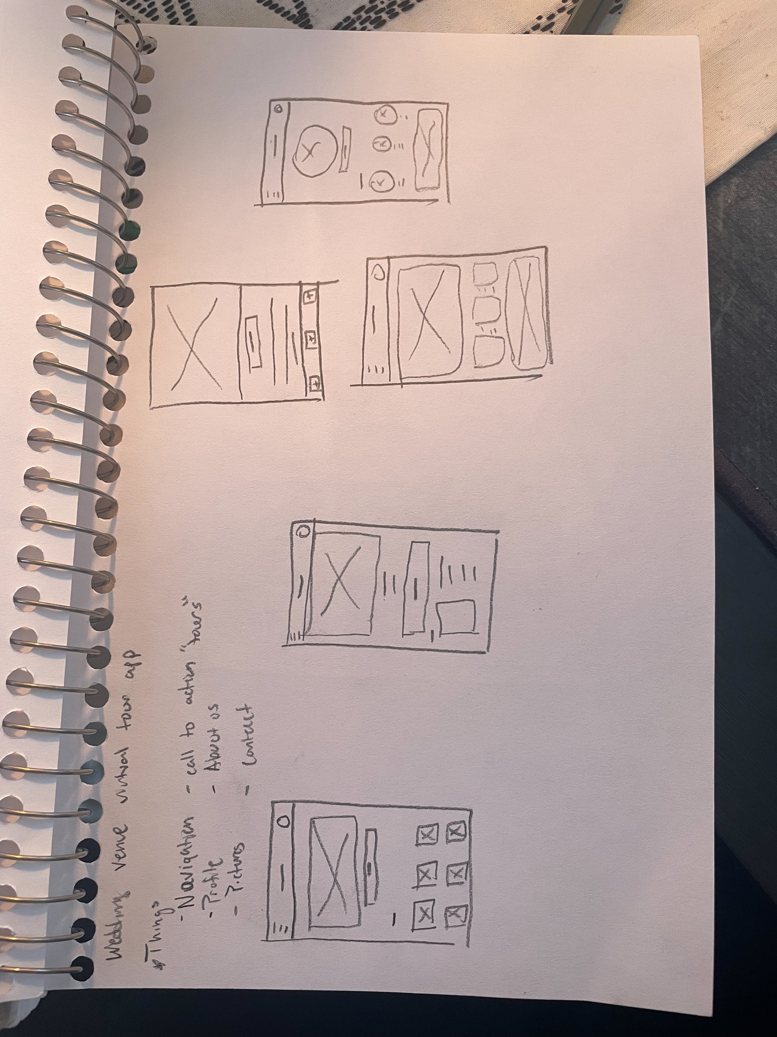
Early Wireframes and Prototype


After completing a low fidelity prototype and putting together all of my wireframes, you can view the low fidelity prototype here), I took to the streets to test my lofi prototype on some real world users. By streets I mean my social media, where I asked if anyone wanted to partake. I found five good candadates and had them try to run through the prototype to complete three different tasks. Here’s a link to the google form that I created to run these studies digitally rather than in person to make it easier and more comfortable for users.
Usability Study: First Round
Round 1 Findings:
Users found the app easy to use
Users found the app familiar
Users found profile to be unnecessary
After the first round of studies were over I began taking what I learned from the studies and the user feedback to iterate on my designs to make them even better. Once that was fixed up I then started working on some more high fidelity mockups and prototypes.
Usability Study: Second Round
After completing the high fidelity prototype and adding more detailed elements I did one last usability study to check my work in a way. This study also included five different users but were all different from the first round of testing so that I wouldn’t run into any bias.
Round 2 Findings:
Hamburger menu was difficult to close
Add the “booking” button to the first Page
The UI is simple and easy to digest
After recieving the feedback from my participants I was able to then take those findings to interate on my designs. I made the hamburger menu more intuitive to use, added a “booking” button to the home page and finished up some more areas of the app that I wanted to work on. Overall, this app came out pretty well for my first time going through the process and I am proud of it.
High Fidelity Wireframes and Prototypes


Impact:
Most users who tested this app in the final stages really enjoyed the simplicity of the app and how it has a “modern” feel. They also enjoyed who easy it felt to use.
Key Takeaways
What I learned:
I learned a lot about how to change and iterate my designs through the user feedback I got throughout the design process. I found different practices in figma which made the process much faster and will make my future designs better.
I would love to send this out to the venue I made it for to see if they would be interested in it. I’ll be using this project as a basis and something to learn from for my future designs so that I have a good base to compare myself to. I’ll likely come back every now and again when I learn something new in my future designs to add even more and update this design that I have created. All in all this first project was a big success in my eyes and everything that I learned from it will be in my arsenal going forward!